52 Frames: Difference between revisions
| (4 intermediate revisions by the same user not shown) | |||
| Line 1: | Line 1: | ||
https://52frames.com/ | https://52frames.com/ | ||
= 2021-03-14: Color Relationship! = | |||
It's time to pay attention to the C O L O R S in your photo this week! Try and think about how the colors in your photo interact with each other. | |||
There are many "color relationships" you can choose from. | |||
* You might go with "complementary colors." which pushes contrasting colors that appeal to the eye. | |||
* You might even choose to go for a minimalistic color approach, where you use slightly different versions of the same color. | |||
Use the same color palette throughout your frame for an easier, more streamlined look for your viewers OR do the opposite, and have pops of different color in order to bring out different aspects or subjects of your photo. | |||
Analagous colors are those that belong in the same range of the color wheel - they're more subtle and often can be interpreted as being similar to each other. | |||
Finally, consider the emotional connect that certain colors bring out within us all - | |||
REDS might represent passion and warmth, BLUES are often associated with calmness, GREENS can make us think of vibrance or even act as a balance between warm and cool colors. | |||
We live in a world of C O L O R - it's time to pay extra attention to it this week. | |||
= 2021-03-07: Negative Space = | |||
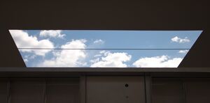
Negative space refers to the space around your subject, and when done right, can actually both attract attention to your subject and it's spacious surroundings! | |||
Using negative space will yield a great "minimalism" approach; this of the old adage "less is more". Take out all distraction. Keep your whole frame clean of "clutter". | |||
This is also a great time for assymetry to play more of a part in your composition. Look out for clean backgrounds like walls or an overcast sky. Negative space need not mean plain and bland backgrounds - texture and contrasting colours can also be used to play a part in "framing" your subject effectively. | |||
Striking a good balance between the negative space and your subject is essential - make the space work for what you want to depict. | |||
== Test Shots == | |||
{| class="wikitable" | |||
|- | |||
|[[File:ASU Metal Shade.jpg|300px|thumb|A giant metal shade with a hole in the middle over an outdoor conversation area.]] | |||
| | |||
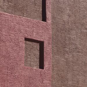
[[File:8th Street Apartment Complex 01.jpg|300px|thumb|Apartment Complex Architectural Detail]] | |||
| | |||
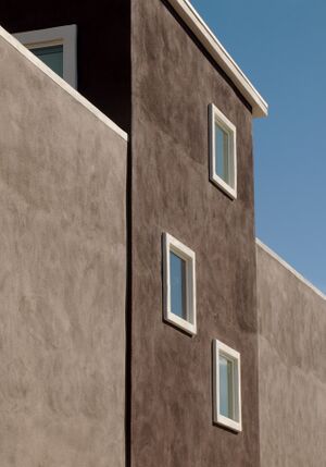
[[File:8th Street Apartment Complex 02.jpg|300px|thumb|Apartment Complex Architectural Detail]] | |||
| | |||
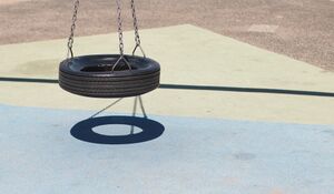
[[File:Tire Swing 01.jpg|300px|thumb|Tire Swing 01]] | |||
|- | |||
| | |||
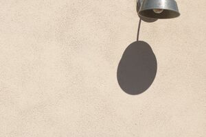
[[File:Outdoor Lighting Fixture.jpg|thumb|Outdoor Lighting Fixture]] | |||
| | |||
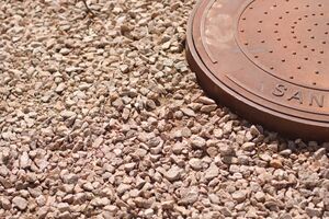
[[File:Manhole Cover in Desert Landscape.jpg|300px|thumb|Manhole Cover in Desert Landscape]] | |||
| | |||
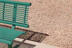
[[File:Park Bench in Desert Landscape.jpg|300px|thumb|Park Bench in Desert Landscape]] | |||
| | |||
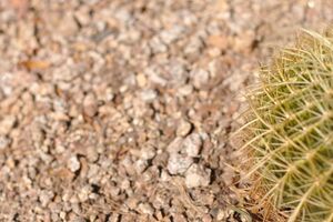
[[File:Cactus in Desert Landscape.jpg|300px|thumb|Cactus in Desert Landscape]] | |||
|- | |||
| | |||
[[File:Resolute Padlock.jpg|300px|thumb|A resolute padlock bearing the strain through the years under the harsh Arizona sun.]] | |||
| | |||
| | |||
| | |||
|} | |||
= 2021-02-28: Details = | = 2021-02-28: Details = | ||
| Line 24: | Line 80: | ||
|} | |} | ||
= 2021-02-21: | = 2021-02-21: Roll Credits = | ||
Challenge: It's the last scene of your movie, just before the credit roll, what shot are you leaving your audience with? | Challenge: It's the last scene of your movie, just before the credit roll, what shot are you leaving your audience with? | ||
Latest revision as of 14:05, 6 March 2021
2021-03-14: Color Relationship!
It's time to pay attention to the C O L O R S in your photo this week! Try and think about how the colors in your photo interact with each other.
There are many "color relationships" you can choose from.
- You might go with "complementary colors." which pushes contrasting colors that appeal to the eye.
- You might even choose to go for a minimalistic color approach, where you use slightly different versions of the same color.
Use the same color palette throughout your frame for an easier, more streamlined look for your viewers OR do the opposite, and have pops of different color in order to bring out different aspects or subjects of your photo.
Analagous colors are those that belong in the same range of the color wheel - they're more subtle and often can be interpreted as being similar to each other.
Finally, consider the emotional connect that certain colors bring out within us all -
REDS might represent passion and warmth, BLUES are often associated with calmness, GREENS can make us think of vibrance or even act as a balance between warm and cool colors.
We live in a world of C O L O R - it's time to pay extra attention to it this week.
2021-03-07: Negative Space
Negative space refers to the space around your subject, and when done right, can actually both attract attention to your subject and it's spacious surroundings!
Using negative space will yield a great "minimalism" approach; this of the old adage "less is more". Take out all distraction. Keep your whole frame clean of "clutter".
This is also a great time for assymetry to play more of a part in your composition. Look out for clean backgrounds like walls or an overcast sky. Negative space need not mean plain and bland backgrounds - texture and contrasting colours can also be used to play a part in "framing" your subject effectively.
Striking a good balance between the negative space and your subject is essential - make the space work for what you want to depict.
Test Shots
2021-02-28: Details
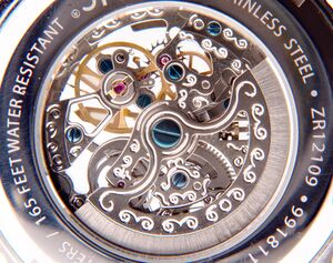
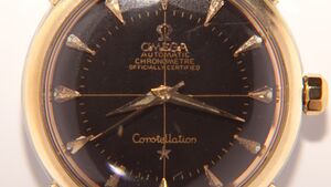
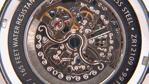
Challenge: This week we're going to be looking hard and close at the finer points of your world. The details that evoke interest are what we're after. Look closely at shapes, structure, texture and even color.
This week you really want to pay close attention to sharpness and focus . However, do be careful that you don't go overboard - it's easy with modern day processing software to over-sharpen and over-process images. Use the tools at your disposal appropriately.
Our world abounds with details that are often overlooked - from architectural features to macro shots of the tiniest creatues. Portraiture and close-ups are filled with the details of what makes us, us. The play of light and shadow often helps to bring out details we might otherwise have overlooked. This week's challenge is meant for us to work on our technical as well as our observational skills.
| Automatic Skeleton #16 | |
| Omega Constellation Chronometer | |
| Automatic Skeleton #1 |
2021-02-21: Roll Credits
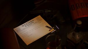
Challenge: It's the last scene of your movie, just before the credit roll, what shot are you leaving your audience with?
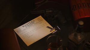
| Koenig's Warning
I used a snoot with a grid made out of black straws to put a little splash of light on the telegram. This draws the eye and makes the background, lit with a warm white bulb, warmer and moodier. I used an ND8 neutral density filter to get the flash dark enough. I had it on its lowest setting, but had it very close to the telegram to minimize the splash on the floor. I added 3200 ISO grain and did my best with color grading. 16:9 aspect ratio and a shallow depth of field complete the attempt at a cinematic look. | |
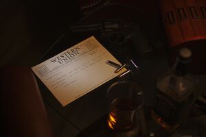
| Koenig's Warning (Lightened)
I used a snoot with a grid made out of black straws to put a little splash of light on the telegram. This draws the eye and makes the background, lit with a warm white bulb, warmer and moodier. I used an ND8 neutral density filter to get the flash dark enough. I had it on its lowest setting, but had it very close to the telegram to minimize the splash on the floor. I added 3200 ISO grain and did my best with color grading. 16:9 aspect ratio and a shallow depth of field complete the attempt at a cinematic look. | |
| Just showing what the picture looked like straight out of the camera. Looking at both images now, it's kind of hard to tell what I did. I added grain, to make it look like cinema film. I also darkened the shadows and cropped to 16:9. |
2021-02-14: Golden Hour
Challenge: Take a photo that captures the magic of golden hour - the first hour after sunrise or the last hour before sunset, when the light is filtered through more atmosphere and takes on a golden cast.
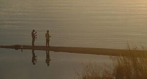
| This was the night of the switch to the latest challenge. Just after I submitted my Single Point of Focus picture, I looked outside and saw the high, even cloud layer. I grabbed my camera, tripod, and an extra lens and raced over to my office building's parking lot. There were others up there taking advantage of the prime shooting location and glorious sunset. I just love when the clouds are lit from below like this. I'm hoping to get some morning clouds that look similar - I have a better place to shoot from. I might do another shot in the evening as well, if I get the chance, from the location of the next shot - shoot the lake's reflection of the burning sky. | |
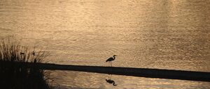
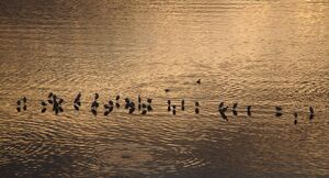
| This really shows the value of shooting a lot of pictures. I kept walking back and forth along the bridge, shooting this picture from different angles. I got pictures with ducks on the lake, ducks in flight, sun glare more or less prominent on the lake, more or less visible ripples. I hadn't intended to have the reeds in the picture at all, this shot was sort of a "well, as long as I'm standing here" thing. I wound up loving how the reeds pick up the golden sunlight, and the two anglers happened to be holding their fishing rods in a photogenic way. It all came together, largely because I shot about 35 pictures. | |
2021-02-07: Single Point of Focus
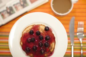
Challenge: Use focus to put a single element in the scene in sharp focus, using sharpness to draw the eye to the subject.
| Test shot to see how blurred the background would be. | |
| First attempt to get the shot I was going for. | |
| Trying a completely different shot, mixing focal plane blur with motion blur. | |
| Moved the camera so the focal plane was parallel to the plane of the pancake. Used a small plate, small pancake, and small blueberries. Used forced perspective with the plate elevated on a pint glass to make the plate look normal size relative to the setting. Coffee cup is a short demitasse to keep the rim well below the focal plane. |
2021-01-31: Horizon Lines
Challenge: Take a picture that incorporates horizon lines as a dominant element.
| Tempe Town Lake pedestrian bridge, flat and parallel to the surface of the water. |
